Have you been looking for Facebook Carousel ad examples? Well, look no further. We have collected the TOP 5 Facebook Carousel Ads Examples for Services, Ecommerce, Information products and Software. Get inspired by these Facebook Carousel Ad Examples and show off your products in an interactive way!
Why use Facebook carousel ads you ask?
- 1) Showcase multiple products/ services/ benefits in one ad.
- 2) Cater to many different needs and wants of your target audiences.
- 3) Use different fonts, eye-catching colors, and creative imagery and videos to grab attention
- 4) Lower your cost per click
- 5) Increase your engagement
Scroll down to learn more about Facebook Carousel Ads, get some tips and see some high-ranking carousel ad examples from some of your favorite companies.
What we will cover in this guide:
What is a facebook carousel ad exactly?
A Facebook carousel ad is a format where you can add up to 10 cards of images, videos, headlines, descriptions, and CTA’s in a single ad. It allows you to cater to various types of wants and needs of your target audience with each card being able to have its own descriptions and benefits.
Carousel ads are used to:
- - Tell a story
- - Highlight multiple products/product features
- - Explain a process
- - Sell the benefits
- - Create a larger canvas for products.
Below we have created a collection of high-ranking Facebook carousel ad examples from some of your favorite companies. For each of these ads we have listed what we like about them, what can be done better, and who these ads are targeted towards. These ads can be used as inspiration for your own ads.
20 Best Facebook Carousel Ad Examples
Below you will find 20 of the best Facebook Carousel Ad examples that we have found just for you. These ads come from top ranking companies that you are sure to have heard of and may have seen before. We will be giving you an insight into what we think is good about each ad, what we think can be improved and who these ads are targeted towards. Scroll down to see our Facebook Carousel Ad example, and more...
Best Carousel ads for Ecommerce
1. BarkBox
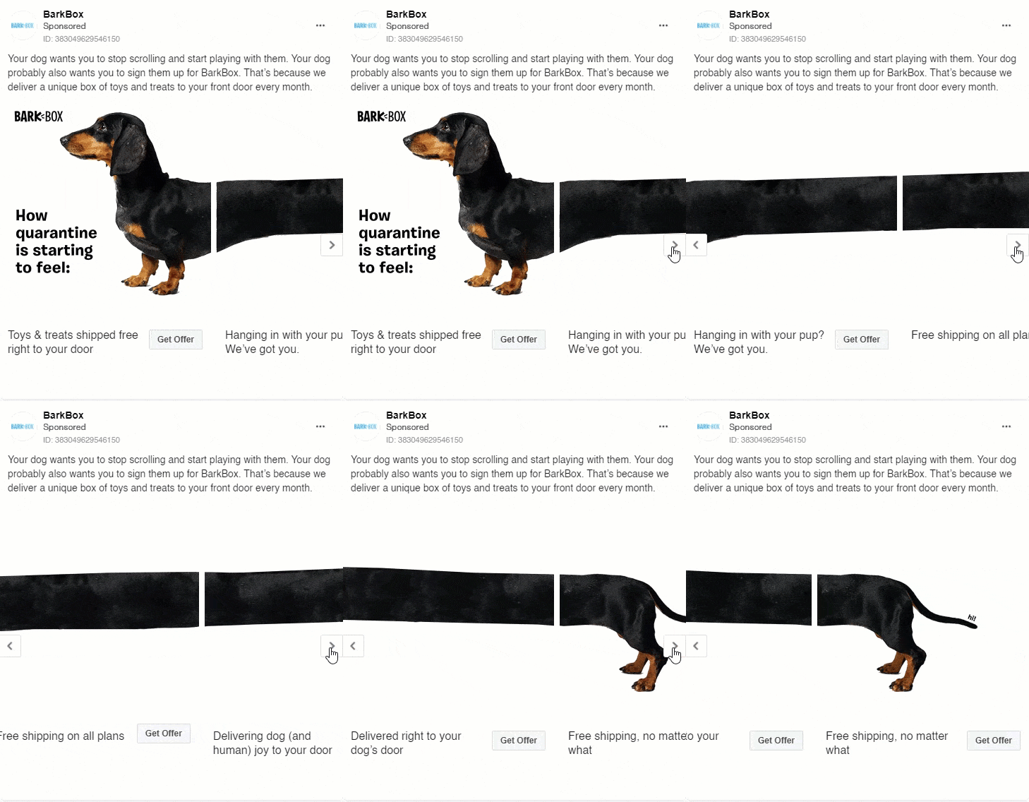
BarkBox is a service that provides high quality dog products delivered to your door each month. This services provides toys, treats and goodies for your furry friends.
Who is this ad for ?
This ad is targeted towards dog owners specifically. Owners who would like to get extra materials to keep their dog busy such as toys and treats. Others can use this as a creative example for their own ads if they are selling a product/service.
What makes this ad good?
- - This ad shows a fun and interesting use of design.
- - Each card shows its own description and benefits.
- - This ad encourages you to engage and continue swiping to know the full image.
- - It also tells a story that will appeal with viewers in any time period.
What could be improved?
- - This ad could do with a bit more colors and interesting text/ images. As is right now it is a bit plain with only the one image even though it is stretched out across multiple cards.
- - What would enhance this ad is if some cards would have been to showcase the actual products for their users to see exactly what they are offering.
2. Garmin
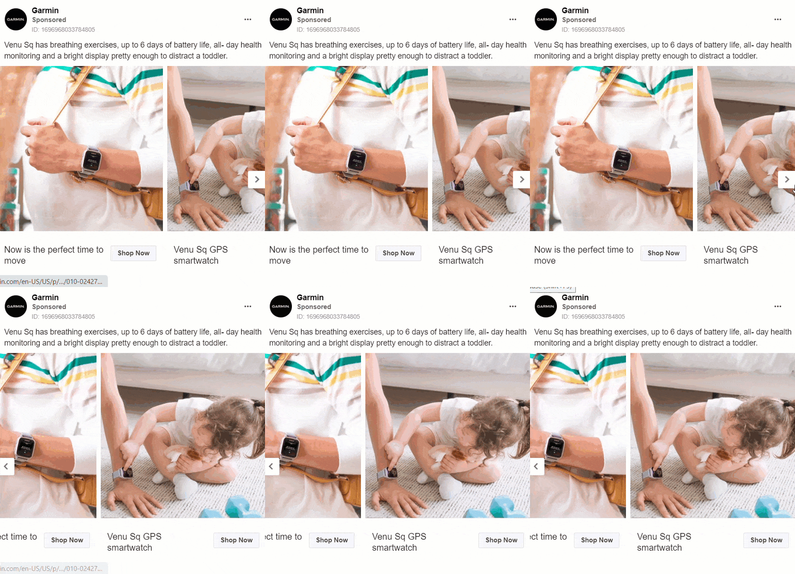
Garmin is a company that produces high-end digital watches for all ages. These watches include features such as fitness tracking, health monitoring, GPS and long battery life.
Who is this ad for ?
This ad is for people who are interested in high end watches that are also digital. It can be used as inspiration of a simply designed carousel ad.
What makes this ad good?
- - What is good about this ad is that it is short and straight to the point.
- - It only uses 2 cards but still highlights the product that they are selling.
- - This ad highlights the product benefits and tells you why you should get the product through these benefits.
- - The images have bright colors and have the same scheme. Each ad also has its own headlines.
What could be improved?
- - This ad could have a bit more text description about the product. Such as what it is made of or where it is made.
- - There could also be more encouragement from this ad for viewers to engage such as more CTA’s.
3. Shein
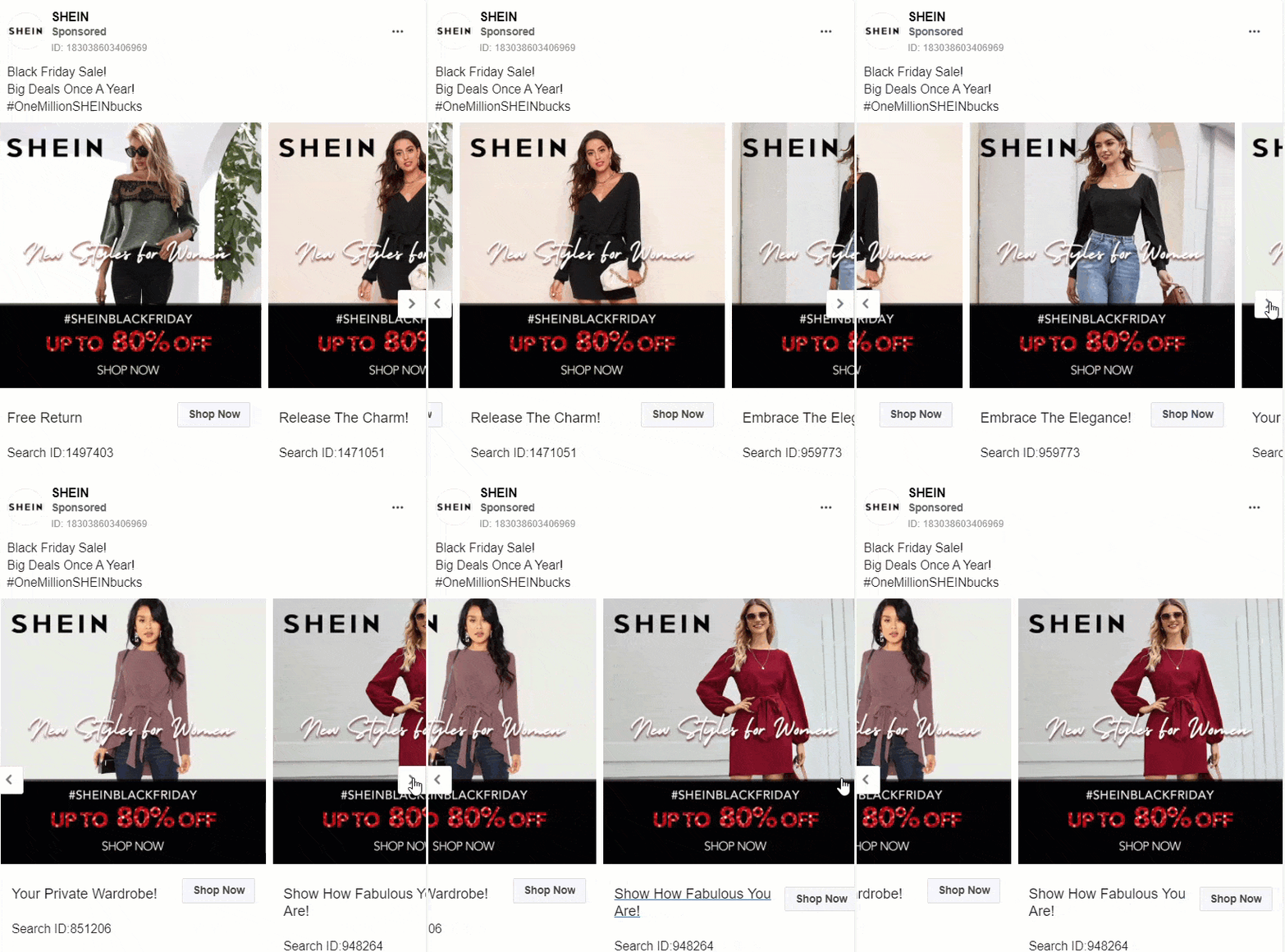
Shein is an affordable clothing brand that produces the latest trendy fashions and that is accessible to everyone.
Who is this ad for ?
This ad is targeted towards females specifically that are looking to purchase fashionable and trendy clothing items at an affordable price. Also, people that are interested in big discounts on items for Black Friday.
What makes this ad good?
- - The description is short and straight to the point so that viewers knew exactly what this ad is about.
- - Each card in the ad showcases a different product from the company's selections.
- - These images all show use of the items available and are all photographed and designed in a similar way to each other.
- - The cards all have their own empowering headlines and also shows the ID number of the item shown in the images.
What could be improved?
- - There could be a bit more text and description about the sales. Such as how long it will last, if it is only on select items or sitewide, when it will end, etc.
4. Ralph Christian Watches
Ralph Christian Watches is a company that creates high quality luxury timepieces at an affordable price. This company is mainly catered towards men.
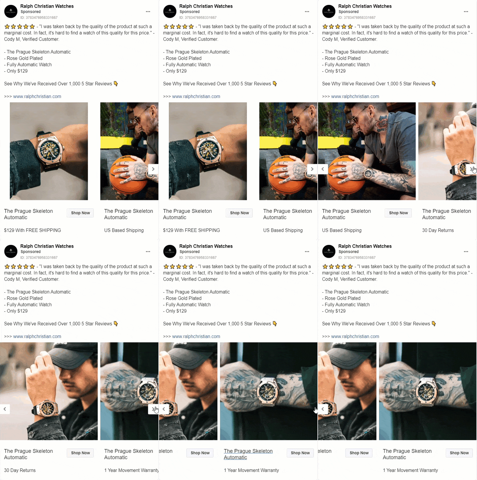
Who is this ad for ?
This ad is for viewers that are interested in purchasing a high quality luxury watch at an affordable prices
What makes this ad good?
- - Short and straight forward with a clear product description in the text.
- - The imagery showcases the product in use. The same color scheme is used throughout the images.
- - Each card has its own benefits listed even though they all have the same headline.
- - This ad gives a good visual of the product itself so that viewers cans exactly what they will be getting from their purchases.
What could be improved?
- - There could have been more cards that showcased only the product
- - There could also have been cards that highlighted its features and benefits.
- - Each card could have had its own headlines
- - Can be made to encourage more engagement with the ad.
5. Nike
Nike is a company that creates an produces activewear. Theses items include, shoes, clothes, and accessories.
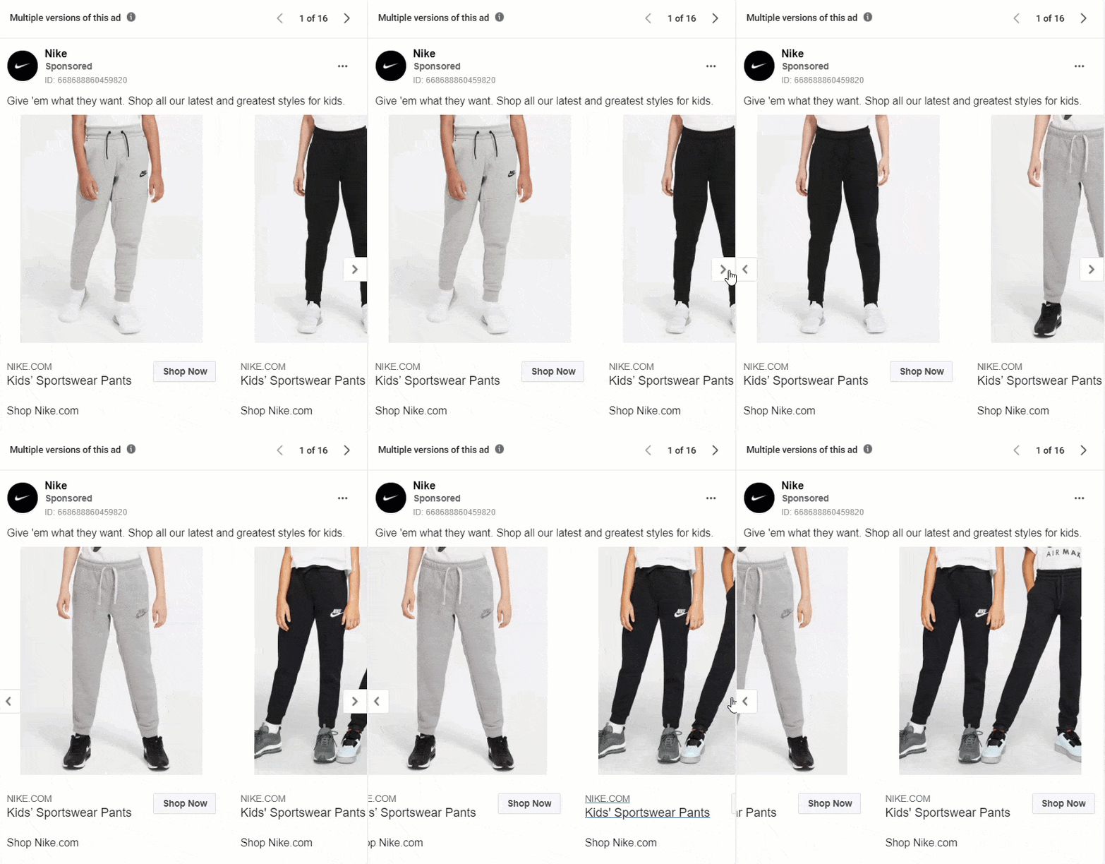
Who is this ad for ?
This ad specifically is targeted towards parents of younger children. In the ad there are items shown for children who may be athletic. These items provide both performance and comfortability in one.
What makes this ad good?
- - This ad uses original content and images while showcasing a simple but effective design.
- - The ad uses models to show the products.
- - There are clear CTA's and the headlines link to product pages directly.
What could be improved?
- - There can be better descriptions of the product.
- - A list of product benefits can be added to invoke more interest from viewers.
- - Could be a little more creative with the imagery
Best Carousel ads for Software
6. Ada Health
Ada Health is a health app created by professional doctors to help people improve their health and care. It also allows you to check your symptoms and what the causes might be.
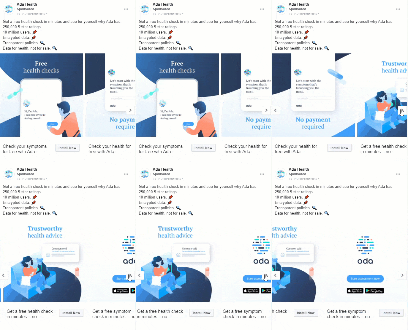
Who is this ad for ?
This ad is targeted towards viewers who would like to learn solution on improving their health, wellness, and care.
What makes this ad good?
- - The bright colors in this ad catches one's attention while scrolling.
- - The text and descriptions is not too long and includes product benefits.
- - Each card showcases a different aspect or benefit of this software and has its own headlines.
What could be improved?
- - There is not much about this ad that may need to be changed or added. This ad is simple and straightforward. Viewers will know exactly what the ad is about.
7. Russell Brunson
Russell Brunson is the co-founder of the software company ClickFunnels. He is also known for being an entrepreneur and has sold many books that helps tens of thousands of entrepreneurs quickly get their message out to the marketplace.
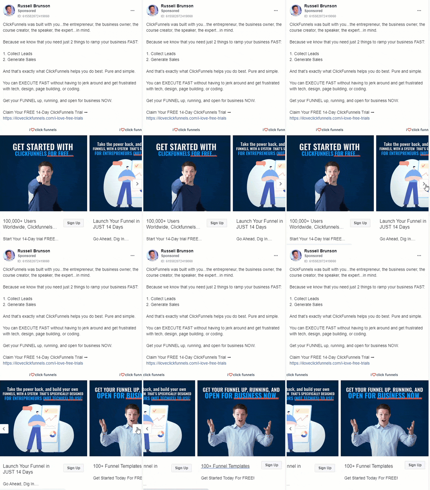
Who is this ad for ?
This ad is for people who would like to get more leads, conversions and generate more sales by using funnels.
What makes this ad good?
- - The descriptions and explanations make this ad clear to all readers.
- - When reading the description you know exactly what this ad is about.
- - There are even benefits listed so readers know what they will be learning.
- - Each card has its own headlines and descriptions.
- - The images and text encourage users to learn more about this offer.
What could be improved?
- - There could have been different images used for this ad that could have assisted the text a bit better.
- - There is also possibly a little too much text. Can be more to the point.
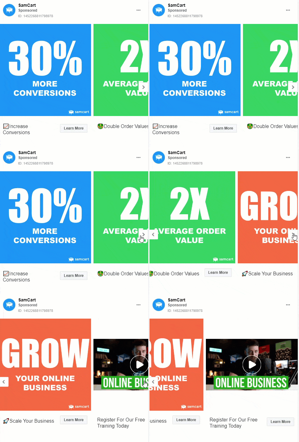
8. SamCart
SamCart is a web-based check out platform that features conversion-optimized check out templates.
Who is this ad for ?
This ad is for people who would like to receive training on how to grow their businesses.
What makes this ad good?
- - Each card shows a benefit of this product in the headline.
- - The images have eye catching colors and shows examples of results are attainable with using this product.
What could be improved?
- - The ad can have more text and description about this training.
- - Also, more information on the benefits of following this training and how this software can be used.
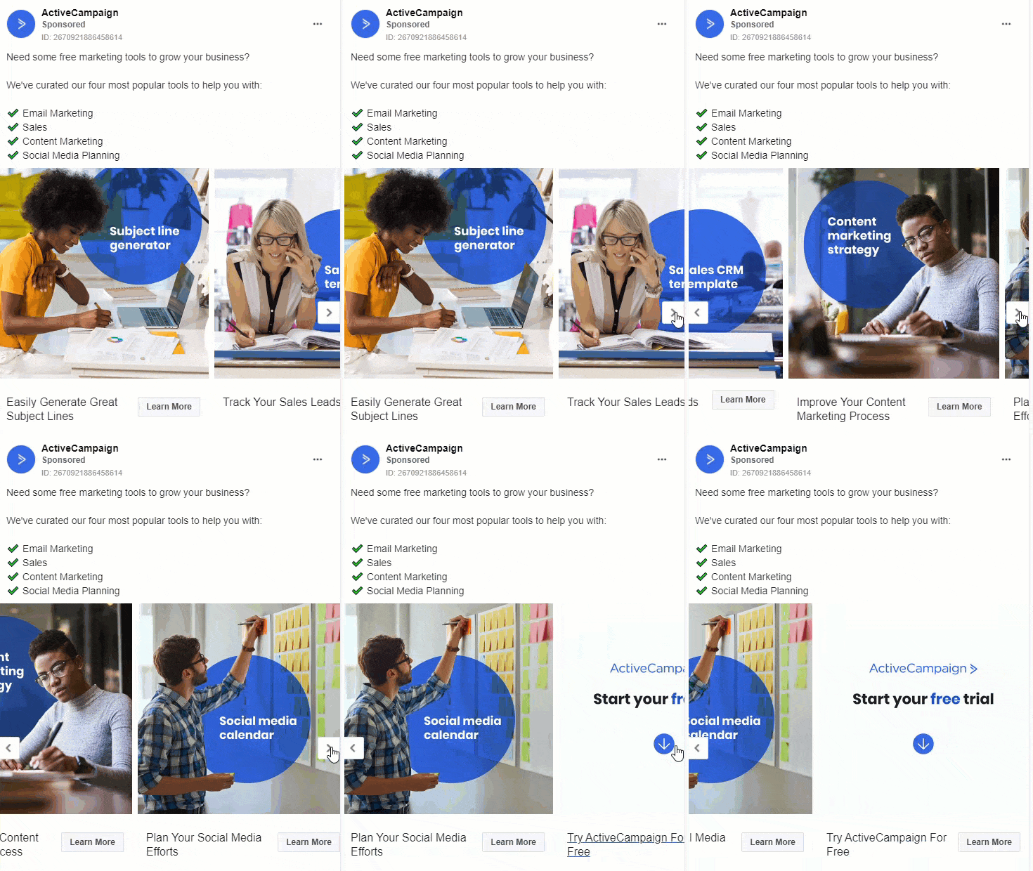
9. ActiveCampaign
ActiveCampaign is a software that helps businesses make meaningful connections with their customers with their customer experience automation platform
Who is this ad for ?
This ad is targeted towards business owners / marketers would like to gain access to and learn about tools that will help them to grow their businesses
What makes this ad good?
- - Product features and tools that can be used are shown in the text within the images and listed in the description.
- - Each card has its own headlines that link to the product pages of the website.
- - There is a good use of colors and imagery to this ad.
What could be improved?
- - This ad could be better if each card would have its own descriptions and show benefits of using this product.
- - Also, if there were cards showing how to use this product.
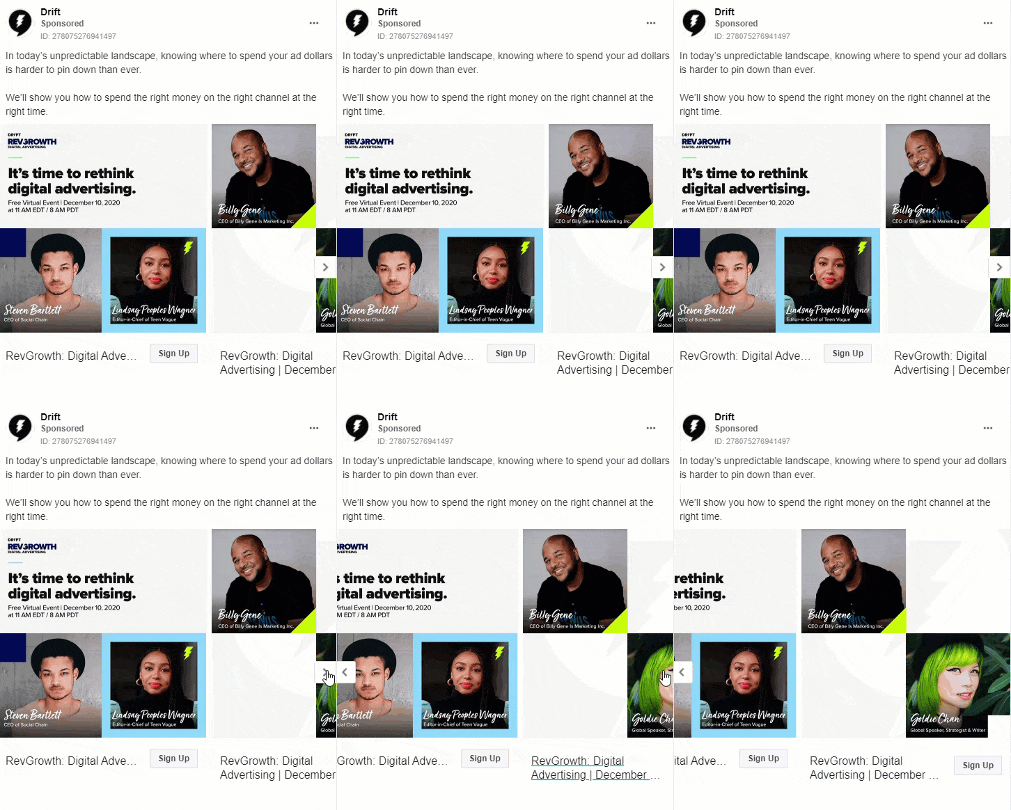
10. Drift
Drift helps businesses to communicate with their website visitors in real-time to help generate leads and improve sales. This software helps companies increase their customer experiences and loyalty.
Who is this ad for ?
This ad is targeted towards viewers who like to do better on their advertisements for their businesses
What makes this ad good?
- - Short and straight forward.
- - There is a good use of imagery and design in this ad.
- - The cards displays the people providing this training.
What could be improved?
- - There could be additional cards that showcase more information about this software and how it works.
- - Each card could have its own descriptions and headlines.
- - Also, there could have been additional benefits shown.
Best Carousel ads for Courses & Info products
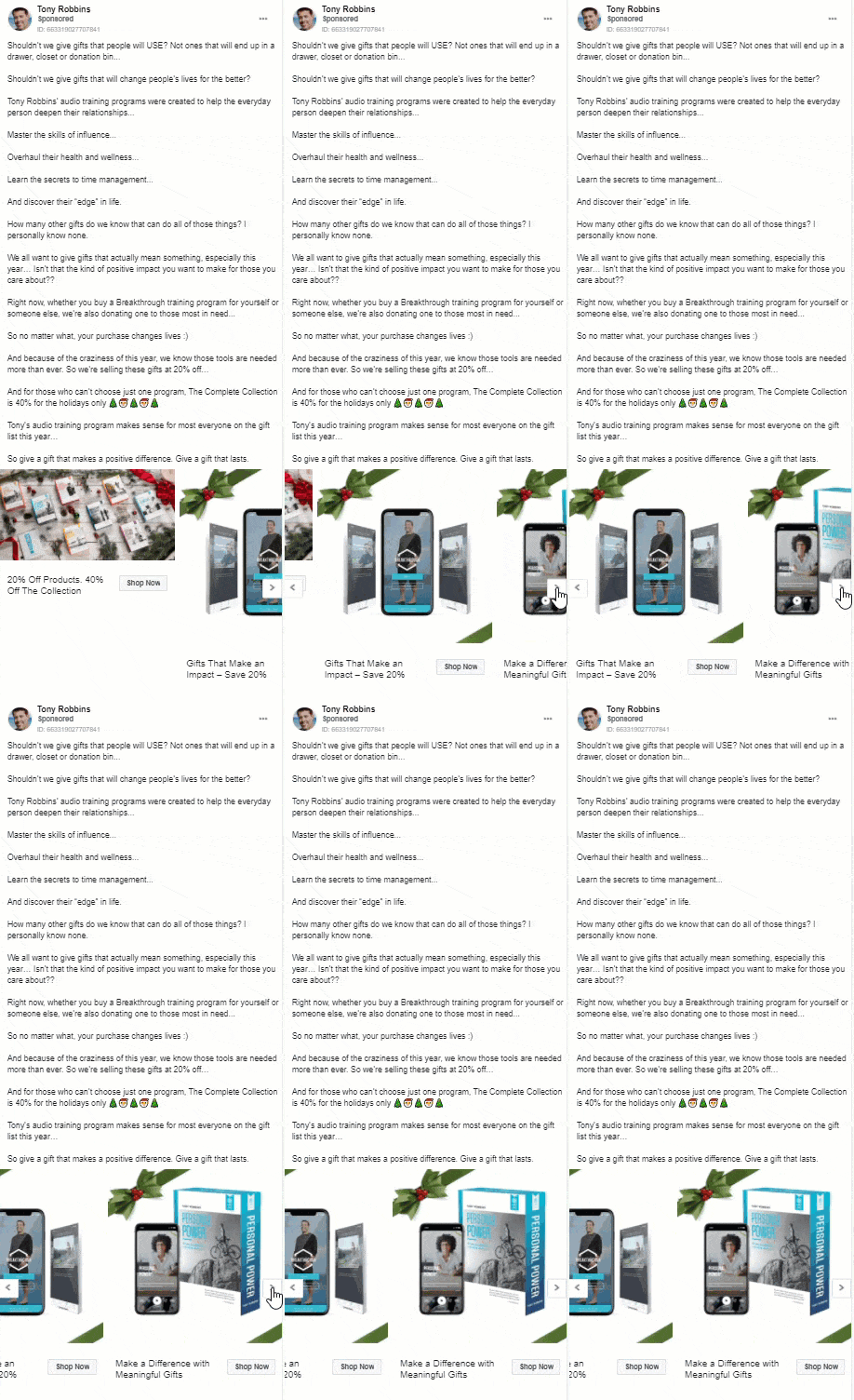
11. Tony Robbins
Tony Robbins is an entrepreneur, a #1 best selling author and a life and business strategist.
Who is this ad for ?
This ad is for people who would like to find meaning gifts for others. Viewers are able to get a training program with a discount and can also purchase gifts with a discount.
What makes this ad good?
- - This ad has a very good description of what this ad is about and what are the benefits of using it.
- - Each card highlights the training program and has its own headline and link.
What could be improved?
- - There is a bit too much text in this ad making it not as interesting to read at first glance. Too much text causes viewers to often keep scrolling if the ads are not as interesting and eye catching as possible.
12. CXL
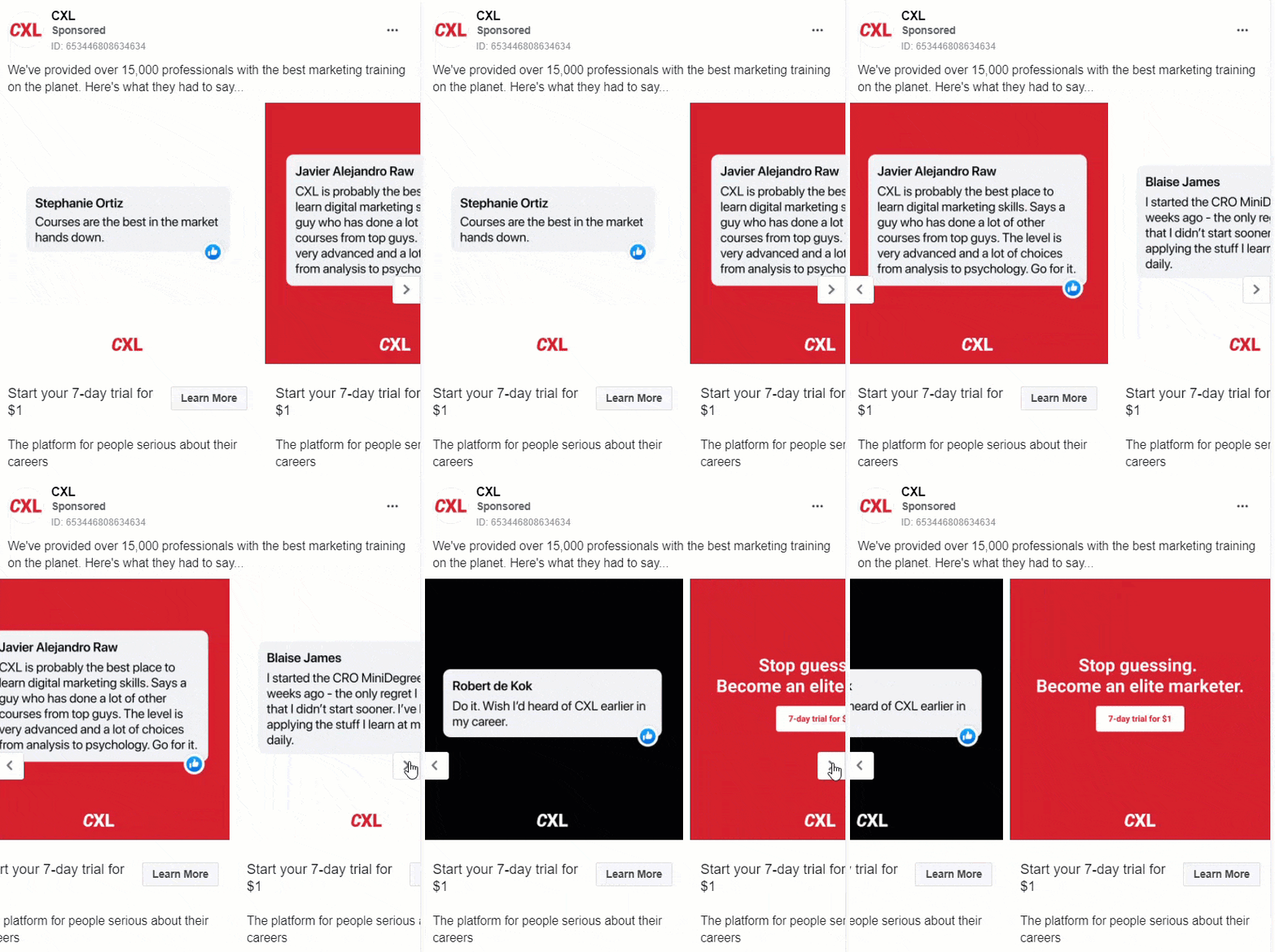
CXL is a company that provides marketing training programs to people who would like to grow their business, manage online revenue optimization and experimentation services.
Who is this ad for ?
This ad is for people/ marketers that want to learn new digital marketing skills. Also for viewers interested in have an affordable free trial to decide whether this is something they would like to do and/or if this is the company they would like to use.
What makes this ad good?
- - This ad shows reviews of satisfied participants from their program.
- - There is a simplistic look to this ad.
- - The text is short and gets right to the point it instills curiosity and in turn engagement from views.
- - The CTA’s are also clear to understand.
What could be improved?
- - There could be more text descriptions explaining the program and listing its benefits.
- - There could also be more encouragement for viewers to engage with this ad and want to use this company.
13. DigitalMarketer
DigitalMarketer is a company that provides tools and training to become a better marketer. Be able to grow your sales and transform your marketing team with trainings and certifications in lead capturing and revenue generations.

Who is this ad for ?
This ad is for marketers and business minds that want to learn how to grow their business. For those who would like to learn how to attract, convert and onboard clients in 4 steps thought by professionals that use this model.
What makes this ad good?
- - The color scheme throughout the cards are eye catching .
- - Each card has been given its own headline that links to the offer presented.
- - There is a well written description of the event, and it is about and what benefits it has to the people that will attend.
What could be improved?
- - There could have been cards listing the benefits of attending
- - There could have also been cards showing the steps that will be thought and discussed
14. Ryan Levesque
Ryan Levesque is a successful entrepreneur and #1 best selling author who has created a leading quiz funnel software. He is the CEO of The ASK Method Company and have co-founded bucket.io.
Who is this ad for ?
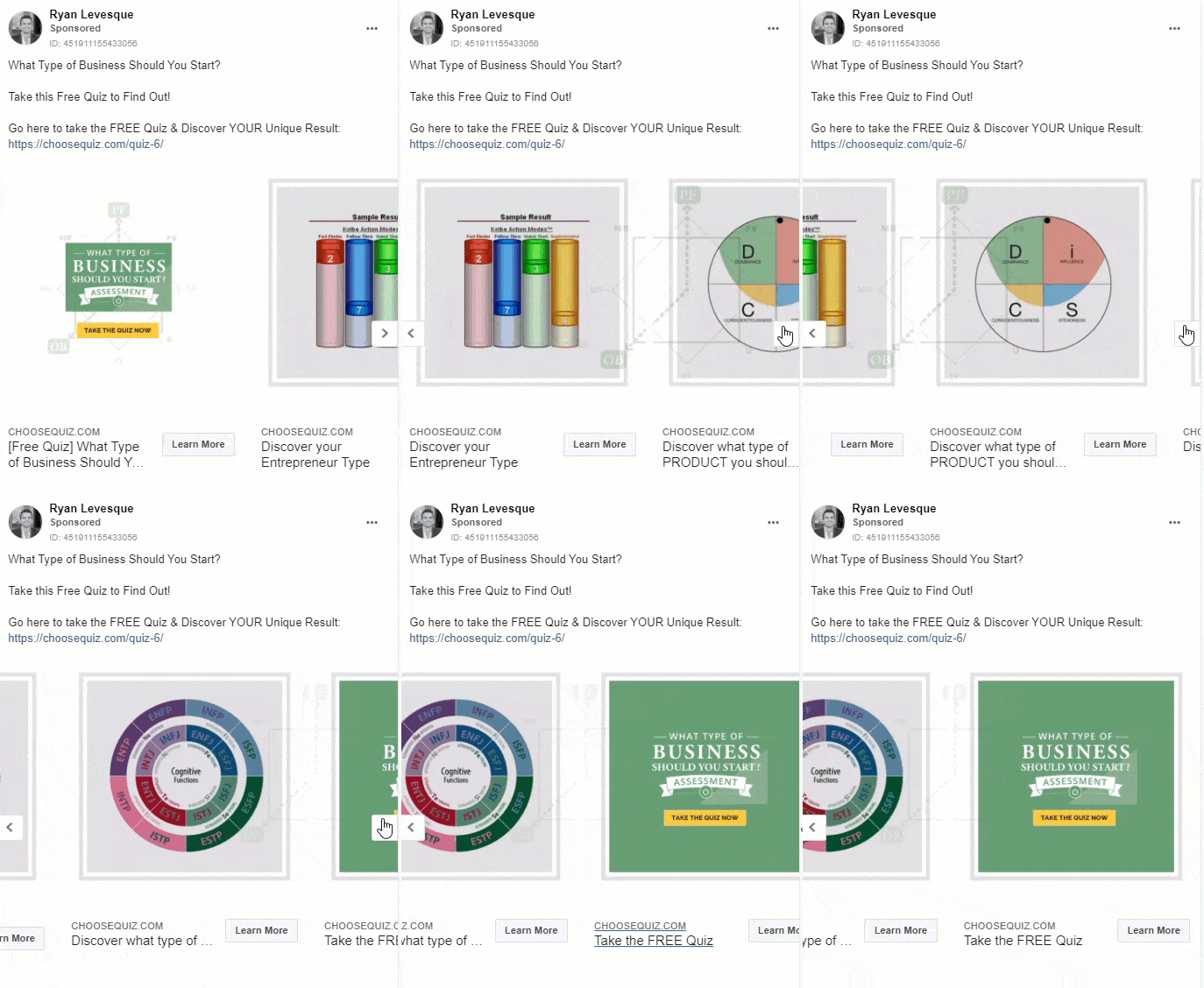
This ad is for people who have thought about starting a business themselves, but do not know what kind of business and where to start.
What makes this ad good?
- - This ad is short and gets straight to the point.
- - It’s description tells you exactly what it is and why you should use it.
What could be improved?
- - There could be more descriptive text about the quiz in this ad, and also be benefits listed. For example, what kind of question will be asked and how this quiz will help this viewer.
- - The images are also not very understandable and should be changed to ones that will be clear to everyone viewing. At first glance, without reading the above text first, viewers will not know what this ad is about which will cause them to continue scrolling past it in their feed.
15. Sweat
Sweat is one of the worlds largest female fitness communities. This company provides a vast selection of at home and in gym workouts for women.
Who is this ad for ?
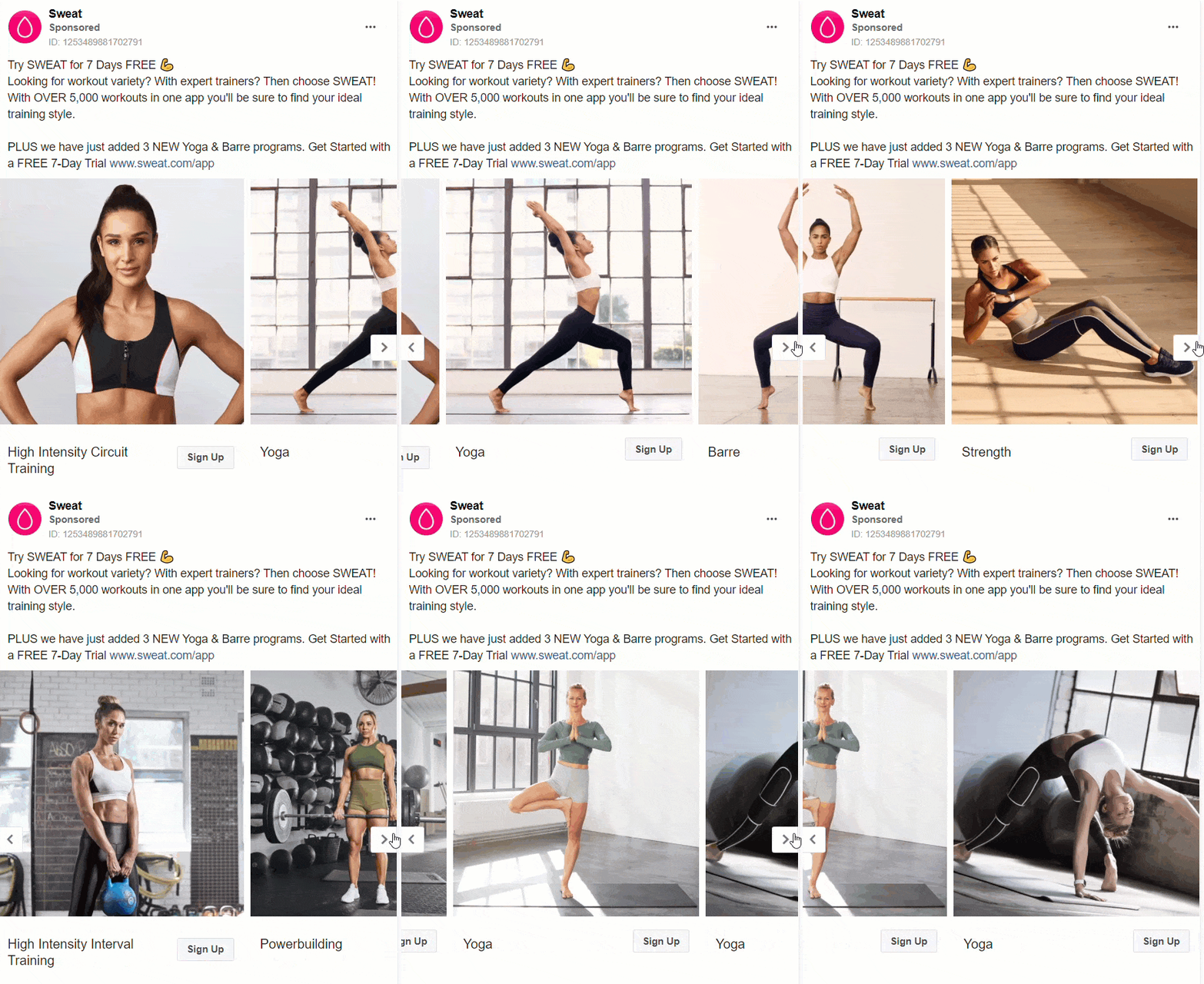
This ad is targeted towards people who would like to get into exercising at home or in the gym. There are a variety of different workouts for users to choose from. Also, for people who would like a free trial to decide whether they would like to use this company or not.
What makes this ad good?
- - This ads description gets straight to the point.
- - Any viewer that comes across this ad will know exactly what it is about at first glance.
- - This company has also made sure to add their product link in the description. Product benefits are also clearly listed.
- - The imagery shows use of the product and product diversity and each card has its own headline.
- - Each picture is similar to another and in the, same color schemes which visually make the cards more appealing.
What could be improved?
- - There could have been a card/s where the benefits of using this program is listed.
- - Each card has a headline but no descriptions to go along with it.
- - There could have also been cards or text descriptions on results from using this program.
Best Carousel ads for Services & Coaching
16. Mint CRO
Mint CRO is company that provides solution to businesses on conversion rate optimization and how to grow their businesses.
Who is this ad for ?
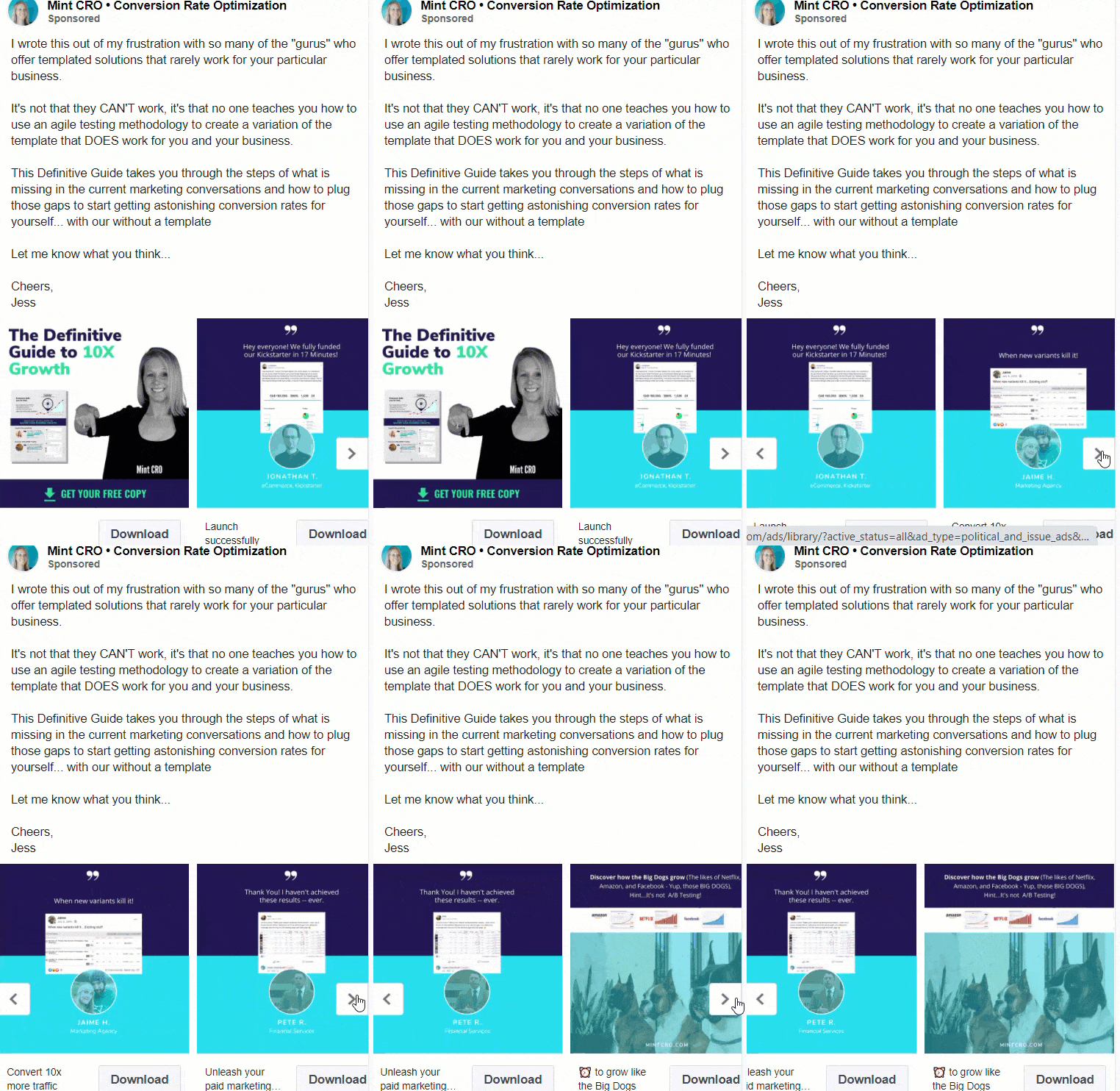
This is ad if targeted towards users who have been having challenges with growing their business and are looking for a solution. People who would like to remove blind spots, get faster feedback and save money on their Facebook ads.
What makes this ad good?
- - Clear to understand text with a description of the service and what they can do for you
- - A benefit is listed and customer reviews of the service are shown.
- - Nice use of information on the cards that give more insight into what viewers can get out of this service.
- - Encourages trial of the service.
What could be improved?
- - The visuals can be better in terms of colors.
- - There could have also been more cards listing extra benefits and services that are provided by this company
17. Banfield Pet Hospital
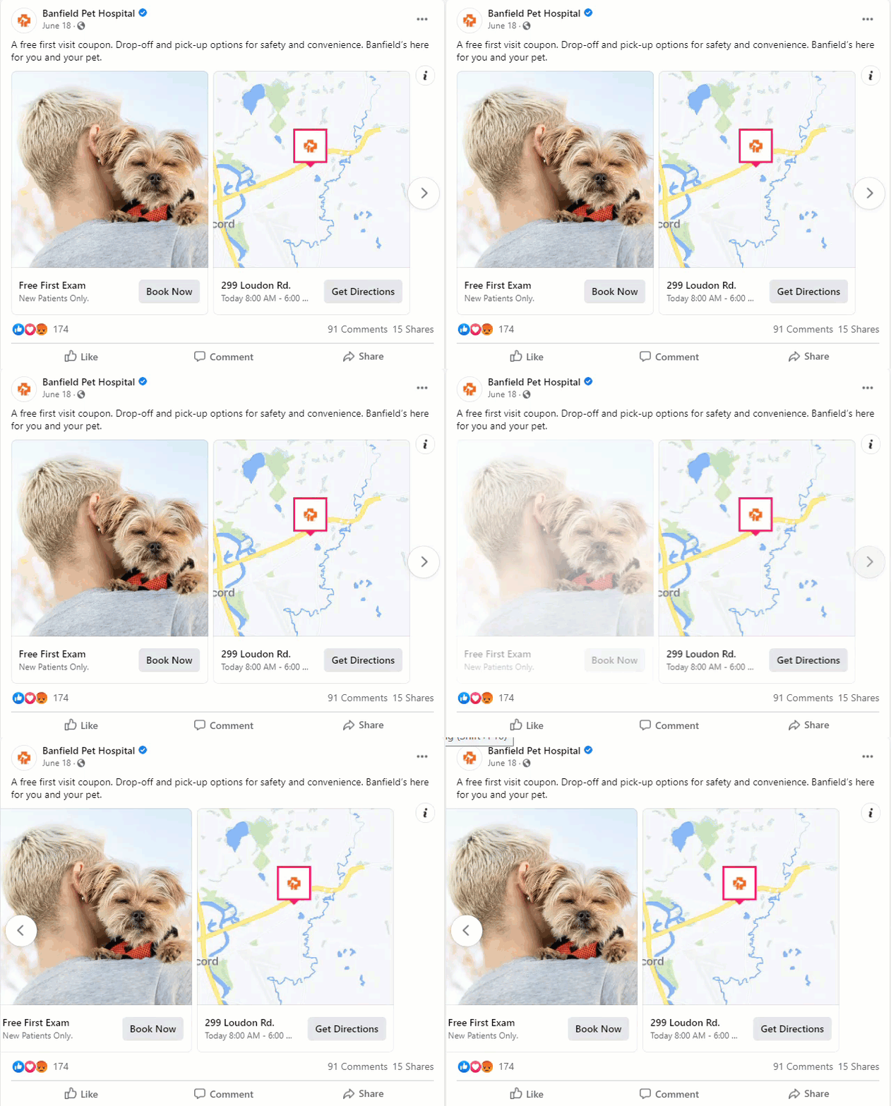
Banfield Pet Hospital is a veterinarian pet health and wellness service provider. They have set wellness plans for pets that require a monthly fee and includes unlimited amount of visits.
Who is this ad for ?
This ad is for people who are interested in signing up for a veterinarian service for the health and wellness of their pets
What makes this ad good?
- - This ad has a simple and overall nice design to it.
- - The text above the cards is short, straight to the point and has benefits of the service listed.
- - Their best card has been shown first as it has a relevant photo and lists' a service benefit in its headline.
What could be improved?
- - There could be more text giving a description of the company and the services that they have available.
- - In addition to the current cards, there could be more cards showcasing the team of veterinarians and the available services.
18. CliniQ
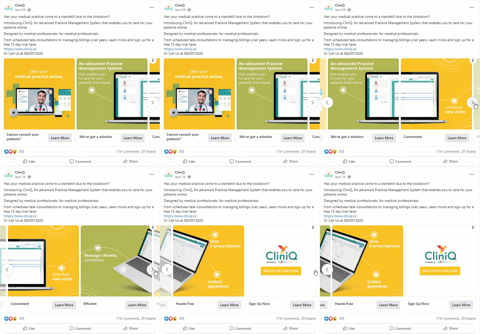
CliniQ is a digital help platforms created by professionals that aims to provide value based care, create healthier environments, and help health care organizations manage technology risks.
Who is this ad for ?
This ad is targeted towards professionals in the medical industry or that have their own practices that may have seen a decline in patients since the pandemic and would like start having virtual appointments with them.
What makes this ad good?
- - This ad uses bright eye-catching colors that makes it instantly more noticeable to users who are scrolling.
- - The images in the cards all fit together and encourages viewers to swipe through them to see the full images.
- - Each card has its own headline which is a benefit of this service and the text of the images gives information on how the service works.
- - The text above the ad also gives information on what this service is and how viewers are able to receive a trial of it.
What could be improved?
- - There could have been cards that showed how the service actually works and of users using it.
19. LinkedIn
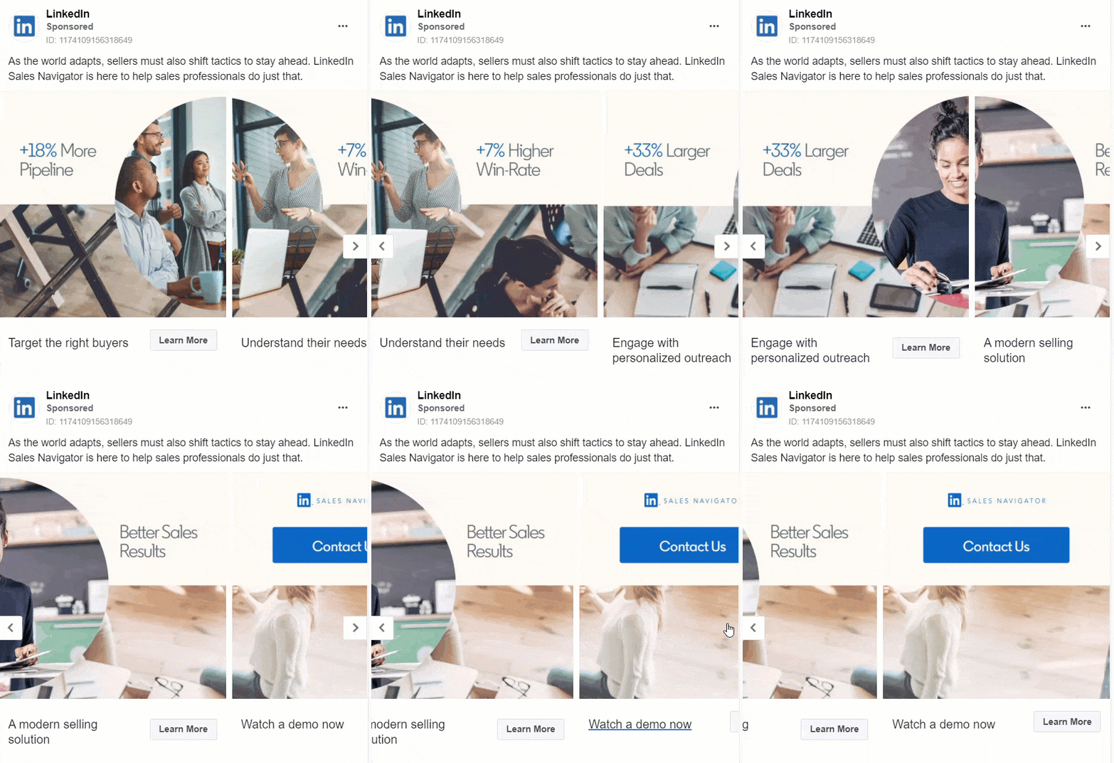
LinkedIn is the worlds largest professional network that provides users with means of finding the right job, connecting with others and building relationships and teaching you skills needed for your future careers.
Who is this ad for ?
This ad is for people who are trying to better their sales. This example can be used by people who would like inspiration on a different kind of way to sell a service.
What makes this ad good?
- - This ad has a good use of imagery that assists the text and descriptions that have been written.
- - Benefits are added to show what is achievable with the service and what they are going to help to do.
- - The example is short and gets right to the point of what it is, what they offer and why you should use it.
- - The images also tell a story across all of the cards.
What could be improved?
- - This ad could do with a bit more description.
- - There can also be cards added or changed to show a small “how to”.
20. Lyft
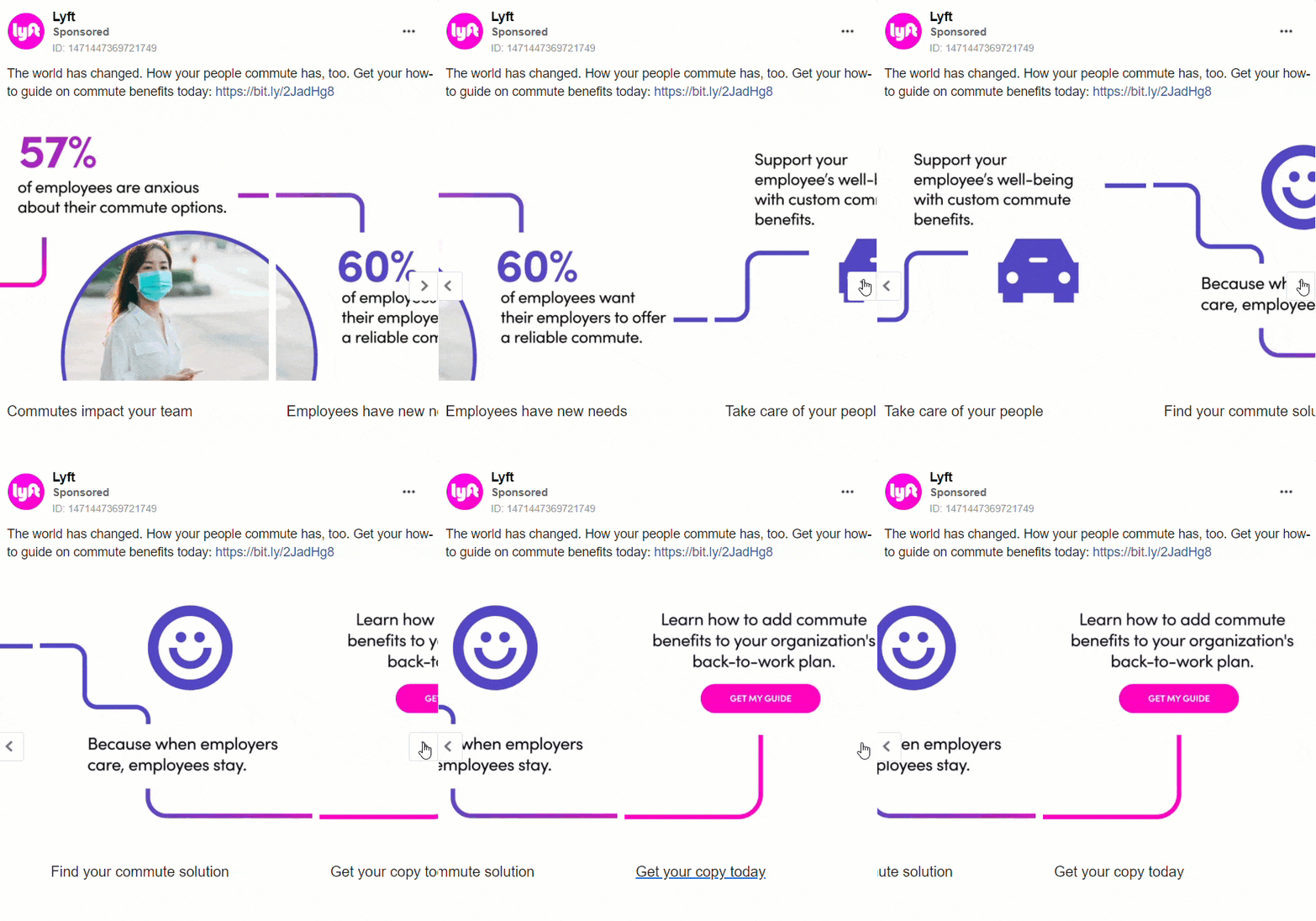
Lyft is a service that provides rideshares providing you with means of getting from where you are to where you need to be.
Who is this ad for ?
This ad is targeted towards people who are going back to work during the pandemic. This ad is also for people who would like to know how to get commute benefits when / for using this company as their method of transport to and from work.
What makes this ad good?
- - The imagery in this ad has been put together very well.
- - Though simple, this ad draws in viewers attention by its bright colors and text.
- - The addition of the bigger font and the colors used on the numbers make this ad more noticeable as viewers scroll through the app.
- - The text descriptions are short and straightforward which helps get the company’s message across.
- - When someone comes across this ad they will know immediately what it is about.
What could be improved?
- - There could have been more description over what the benefits are and how someone can get them in the text listed.
- - Viewers should be able to tell what is happening and what you want them to do. At first glance, a viewer may not understand what the offer is and how to get it.
6 Facebook Carousel Ad tips
We have been able to collect the best Facebook Carousel Ad tips that will help to make your ad stand out against the rest. Below we have 6 tips that you should definitely consider when creating your carousel ad.
- 1) Tell a story - grab attention using images/ videos. Don’t ignore snappy headlines and descriptions and CTA’s. This gives context, encouragement and details to your ad. Overall it makes it more interesting and eye-catching.
- 2) Cohesive and engaging imagery and videos - use images/ videos from the same shoot or that feel similar. For videos use the square (1:1) aspect ratio for each.
- 3) Reach out to your customers - target people that have visited your website and/or product pages. Use lifestyle when targeting prospective customers.
- 4) Show best cards first - order your cards based on their performances. Low performing cards can then be removed or replaced. (NOTE: if you're using the format to tell a sequential story or as a canvas for one long image, you'll want to opt out of this feature when you create your ad)
- 5) Use different landing pages - large businesses with large inventory can take people to specific product pages from carousel ads. Small businesses with smaller inventory can take people to a page where all products in that category are listed from their carousel ads.
- 6) Use a large product set - if you are using a product set for you carousel ad, you must select products with a fairly broad set. Items must be in stock, not rejected, and not variants of the same set. If the amount of items falls less than 2, your ad will turn into a single image ad or stop running.
Facebook Carousel Ad specifications
When creating your Facebook Carousel Ad you must know what the exact requirements are. Below you will find the exact specifications that you will need for text, design and technicalities.
Design Recommendations
- - Image File Type: JPG or PNG
- - Video File Type: MP4, MOV or GIF
- - Ratio: 1:1
- - Resolution: At least 1080 x 1080 pixels
Text Recommendations
- - Primary Text: 125 characters
- - Headline: 40 characters
- - Description: 20 characters
- - Landing Page URL: Required
Technical Requirements
- - Number of Carousel Cards: 2 to 10
- - Image Maximum File Size: 30MB
- - Video Maximum File Size: 4GB
- - Video Duration: 1 second to 240 minutes
- - Aspect Ratio Tolerance: 3%
Summary
In conclusion, Facebook Carousel Ads are a type of Facebook ad that allows you to showcase multiple products / services / benefits in one ad. Carousel ads let you get creative with your ad and allows you to link to multiple product pages. We hope that these 20 Facebook Carousel Ad Examples and Tips were just what you needed to create carousel ads that increase conversion for your businesses.
If you've enjoyed this read and these Facebook Carousel Ad Examples and would like to see more, then be sure to check out our Facebook Ads Library.
Have any feedback for us? Let us know in the comments below. And if you would like to get more post like this one and / or get more Facebook Ad inspiration, Join and Become a Member to gain access to our very own Facebook Ads Vault and more!
This post has been brought to you by EmailDrips - "Unlock all the marketing inspiration you will ever need".

